

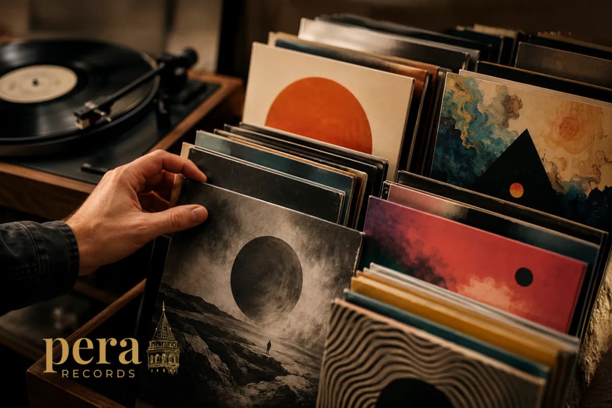
We often encounter an album visually before listening to it. Its colour palette, typography, photography or illustration becomes the first entrance into the world of the music. Before hearing a single note, the listener begins to form an impression of the album’s mood, era and creative identity. Album artwork therefore carries a central role in making an artist’s musical story visible.
How does an image influence music?
Album artwork guides the listener’s interpretation of a recording. Dark tones can suggest an introspective and intense atmosphere, while vivid colours may create an expectation of movement and energy. A minimal composition can highlight a restrained or experimental sound, while a detailed illustration invites the audience into a broader narrative.
A different cover can create a completely different first impression of the same recording. The image shapes the emotional connection, expectations and atmosphere surrounding the listening experience. When the music and artwork share a clear creative language, the album becomes a memorable and complete artistic world.
Why do iconic covers stay in our memory?
Joy Division’s 1979 album Unknown Pleasures offers one of the strongest examples. Designed by Peter Saville, the cover uses a scientific image showing successive pulses from CP1919, the first discovered pulsar. Its white lines against a black background created a powerful connection with the album’s cold, rhythmic and mysterious atmosphere, eventually becoming a visual symbol of the band itself.
Andy Warhol’s banana artwork for The Velvet Underground & Nico demonstrates how a single object can become a complete visual identity. The first editions of the 1967 album featured a peel-away banana sticker, turning the cover into an interactive art object that invited the listener to touch and explore it.
Both covers rely on the strength of a distinctive idea. A single symbol, photograph, colour or graphic system can carry enough meaning to represent the entire world of an album.
From the vinyl sleeve to the digital screen
During the vinyl era, an album cover offered a physical surface measuring approximately 30 centimetres. Designers could use photography, illustration, typography, printing techniques and gatefold structures to create a detailed experience. Listeners held the artwork, examined its details and read the information inside.
In the streaming era, the same image often appears as a compact square on a phone screen. Spotify requires cover artwork to use a 1:1 aspect ratio and dimensions between 640 and 10,000 pixels. Although the artwork is uploaded in high resolution, listeners frequently encounter it at a much smaller scale across album lists, recommendations and sharing screens. This environment gives greater importance to compositions that remain clear and recognisable within a few hundred pixels.
Designing for a small screen
An effective digital album cover usually has a clear focal point. A strong silhouette, simple colour relationship or distinctive typographic system can preserve the character of the artwork at a small scale.
Typography works best when it forms an integral part of the composition. Clear contrast helps the artwork remain visible across light and dark interfaces. A strong overall shape also allows the design to move naturally between streaming platforms, social media posts, posters and physical vinyl editions.
From album artwork to visual identity
Today, album artwork can become the foundation of a broader visual world. Its colours, typefaces, symbols and photographic language can extend across social media, music videos, concert posters, stage visuals and physical merchandise. Spotify’s Canvas feature also expands traditional artwork through looping moving images, giving artists another space for visual storytelling around each track.
A consistent visual identity helps audiences recognise an artist before reading their name. In this way, cover artwork moves beyond a single release and becomes part of the artist’s long-term creative memory.
Music begins in the ear and settles into memory through imagery. A powerful album cover sparks curiosity, gives visual form to the atmosphere of a recording and continues to live in the listener’s mind after the final song ends.